Take A Glimpse of Equity.AI

Revitalizing philanthropy with unforeseen efficiency and efficacy.


Nov. 2022


Conceptualization

In the initial phase, we defined the core objectives and scope of the platform, along with its key functionalities such as forecasting food insecurity rates and deploying sustainable sourcing decisions.

Jan. 2023


Data Harvesting

In this phase, we systematically gathered and curated diverse datasets essential for training and fine-tuning our AI models. The data collected encompasses a wide range of variables, ensuring the accuracy and relevance of our projections.

Jun. 2023


Algorithm Development

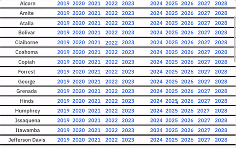
The heart of the AI platform lies in its algorithms. In this step, we focused on developing and fine-tuning machine learning models to forecast food insecurity rates, identify hotspots, and analyzing sentiment for marketing effectiveness.

Sep. 2023


UI Development

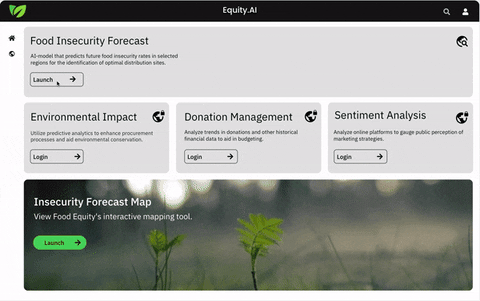
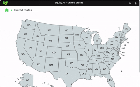
The final step involved integrating all functionalities into a cohesive, intuitive user interface. The UI facilitated seamless interaction with different features, such as viewing forecasted food insecurity rates.

Sleek application? Check.
Equity.UI
Unleash the power of Equity.AI with a beautiful interface.
Use it in three simple steps:
1
Choose your country
Choose your country
Equity.UI's primary features encompass food insecurity forecasting, sentiment analysis for online presence evaluation, environmental impact tracking, and donation management. However, please note that only the food insecurity forecasting tool is accessible to the public, as the other features involve confidential information. Upon launching the food insecurity forecasting tool, users will be prompted to select a country for analyzing food insecurity forecasts. Presently, our services extend to the United States and India, with plans for future expansion to include more countries.
Choose your state
2
Season 12
In this step, users are required to specify the state or locality within the chosen country. Equity.UI enhances this process through an interactive map feature, offering a visual representation for a more intuitive selection experience. This dynamic map allows users to explore and pinpoint their state of interest, providing a granular and engaging approach to choosing the state for in-depth food insecurity analysis.
3
Choose your county & desired year. Enjoy the data!
Season 11
Once the state or locality is selected, users proceed to choose a specific county and year for a detailed analysis. A list of available counties within the chosen state facilitates this selection. Upon choosing a particular county, the software generates a food insecurity rate forecast for the specified year. Additionally, users are presented with a graphical representation of food insecurity rates in preceding years, offering a comprehensive overview of historical trends. Furthermore, Equity.UI calculates the demand for food in the present year by computing the ratio of the funds required to address food insecurity in the chosen county to the total funds needed for the entire state. This percentage is then displayed, providing insights into the urgency and scale of the food insecurity challenge in the selected region.